
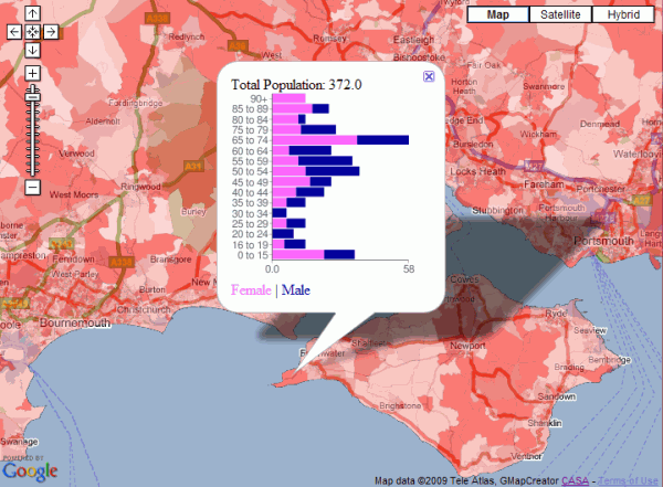
It’s actually a stacked bar chart rather than a traditional population pyramid, but the image below shows male/female population by age for all the output areas in England. The red thematic overlay is total population for every OA, which can be clicked to get the age group breakdown shown in the popup window.
This map is a variation on the original clickable OAC map and was built using a new version of the GMapCreator which contains the clickable technology. Traditionally, maps like this have been built using a server and database to translate the click on the client into a geographic area using point in polygon and then sending the query data back to the client. This method doesn’t scale when you have limited server resources and are looking to handle high numbers of hits, for example with the Mood Maps that we’ve been doing recently. An alternative solution is to build feature coded tiles and let the client handle most of the work displaying the data. Using this system, there is a second set of tiles, one of which the client downloads when the user clicks on a point. This allows the client to work out which feature has been clicked and request the data for that area as an xml file.
The hard part is designing a system which can allow people to design the popup window without having to resort to programming. In the example above, the graph was created using Google Charts via the GMapCreator’s user interface. All that was needed was to choose the data fields from a list and to select the chart type. The URI string to create the chart comes from an xslt transform applied to the xml data. This transform is automatically created by the GMapCreator interface, which also allows the rest of the popup window to be designed using a simple html editor.