A Week in the Life of a Tile Server

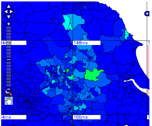
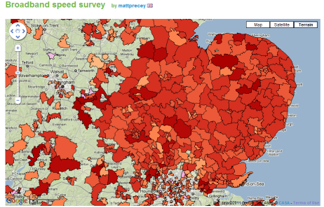
Recently, BBC Look East have been running a “Broadband Speed Survey”, asking people to use an online tester to check their broadband speed, and then enter the value, along with their postcode, into SurveyMapper. This generated 16,311 responses to the survey, but for each response people get to view the map containing the latest data, so the tile server drawing the data on the map gets about 100 times as many hits.

When the survey was advertised on the 18:30 news bulletin on the Tuesday that week, we started to get a huge number of hits in a very short space of time. The following graph shows the hits by hour of day for all five days that week.

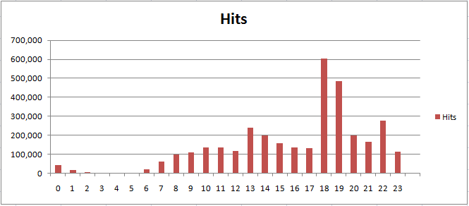
The peaks tie in quite well with the 18:30 and 22:30 news bulletins, but it can be seen from the statistics that the tile server took over a million hits in the space of a couple of hours. The tile server itself is a single machine running Server 2008 R2 Core, virtualised with two processors assigned. Once it became apparent how many hits we were getting, this was increased to 4 processors and 4GB of RAM. This shows the main benefit of virtualisation for us, which is that we could shutdown non-operational machines used purely for research and divert the computing power to the operational web servers which were taking the high loads. In order for the maps on SurveyMapper to work, we are also dependent on a database server and the dedicated web server which runs the MapTube and SurveyMapper sites, in additional to the tile server. What’s interesting about this experience is that it taught us that the database server is capable of handling a much higher load than this.

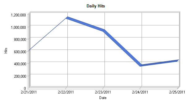
From the graph of the daily hits, it can be seen that most of the traffic was on Tuesday 22nd February, which is the first day it was advertised on the news. After this it tails off as the week progresses. One other interesting thing that was noticed when analysing the log files is the browser and operating system statistics.

Browsers used to access SurveyMapper


Operating Systems
Operating Systems

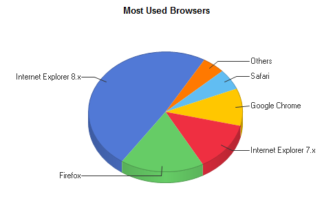
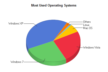
So, from these statistics, it’s a three way split between Windows XP, Vista and 7, with IE8 the most popular browser. Chrome, Firefox and Safari are lagging behind, which is surprising bearing in mind the profileration of Macs.

Now that we’ve proved a single element IIS7.5 server can take a million hits, we’re looking into the possibility of creating multiple tile servers dsitributed across two virtualisation servers and load balancing.

Election 2010: Where Were All the Votes?

Using the General Election 2010 results spreadsheet from the Guardian Data Blog, we’ve produced three MapTube maps showing the distribution of votes for the three main parties:

Conservate share of vote Labour share of vote Liberal Democrat share of vote

The maps can be viewed on MapTube at the following link:

http://www.maptube.org/election/map.aspx?s=DGxUpxGSnLKhUzLIOMHBwKeUwKZUyEDAwcCnksCjlMhBwMHAp5LAoTbd

Use the red slider buttons to fade the distributions for the three parties up and down.

All our election related maps can be found at the following link:

http://www.maptube.org/election/

The UK Election results from the Guardian Data Blog can be found here:

http://www.guardian.co.uk/news/datablog/2010/may/08/general-election-2010-results-maps#data

UK General Election 2010: Results

With 649 of the 650 parliamentary seats from the 6th May 2010 General Election now declared, we can see how the policital map of the UK has changed. The one remaining seat is Thirsk and Malton where the death of one of the candidates means that the vote has been postponed until 25th May. 

Election 2010 ResultPolitical Party Colours

This map has been uploaded to our MapTube website so that the results can be compared with some of our other maps.

Here are some interesting comparisons:

Compare the 2005 election to the 2010 election results:

http://www.maptube.org/election/map.aspx?s=DGxUoiNcsKkGNyyDLBwcCnOMChZsgZwcHApzPApTnd

The 2010 result is shown on the top layer, so move the red slider left and right to see how the political outlook has changed between 2005 and 2010. Apologies for the change in the SNP colour between the two colour scales, but I will upload a new one with standardised colours later. Also, Northern Ireland is missing as we don’t have a boundary dataset for this country, but we are currently trying to obtain one.

Did the MPs’ expenses scandal cause existing MPs to lose their seats?

http://www.maptube.org/election/map.aspx?s=DGxUoiNcsKkGNyyBPAwMCnOcCidsgywcHApzfAoWbd

The top layer shows the parliamentary constituencies where MPs have been told to pay back expenses according to the Sir Thomas Legg report. Slide the top layer slider left and right to see where the parties have changed. This only shows the party colours and not how much MPs were asked to pay back. The result is actually rather inconclusive. Where there are changes, it’s possibly as much a result of boundary changes as expenses repayments. What is required is a comparison that takes both the boundary changes and repayment amounts into account.

Once the final election analysis is available we will add a 2010 turnout map and proportional representation maps of the main parties showing what percentage of the electorate voted for each party by constituency.

Parliamentary Constituencies

With the recent release of the OS Free Data and the up-coming election, I’ve been looking at Parliamentary Constituencies boundaries. It’s not clear from the accompanying documentation which boundary set the OS Free Data is based on, but the following image should clarify things. This is from the OS Free Data:

OS Free Parliamentary Constituencies

Now compare that to the PCON 2010 dataset that I obtained from the Boundary Commission:

PCON2010 Boundary Dataset

This is the set of boundaries being used for the upcoming election as you can see that “Hammersmith and Fulham” has split into “Hammersmith” with “Fulham” being joined with “Chelsea”. This can be verified on the UK Parliament website and matched to their list of constituencies being contested in the General Election.

This means that the OS Free data is either based on the 2001 or 2008 (see National Statistics Westminster Geographies) boundary sets. It also doesn’t help that the Boundary Commission changed on 1 April 2010 from being part of the Electoral Commission to a new department called the Local Government Boundary Commission for England. This also raises the issue of the Irish political boundaries as we don’t currently have any access to them, but could make a substitute set of boundaries from postcode data.

Now that all the constituency boundaries are sorted out, we’re planning to had more electoral maps to our MapTube website, which will be at the following address:

http://www.maptube.org/election

From Tile Pyramids to Population Pyramids

It’s actually a stacked bar chart rather than a traditional population pyramid, but the image below shows male/female population by age for all the output areas in England. The red thematic overlay is total population for every OA, which can be clicked to get the age group breakdown shown in the popup window.

Clickable Age Map
Clickable Age Map

This map is a variation on the original clickable OAC map and was built using a new version of the GMapCreator which contains the clickable technology. Traditionally, maps like this have been built using a server and database to translate the click on the client into a geographic area using point in polygon and then sending the query data back to the client. This method doesn’t scale when you have limited server resources and are looking to handle high numbers of hits, for example with the Mood Maps that we’ve been doing recently. An alternative solution is to build feature coded tiles and let the client handle most of the work displaying the data. Using this system, there is a second set of tiles, one of which the client downloads when the user clicks on a point. This allows the client to work out which feature has been clicked and request the data for that area as an xml file.

The hard part is designing a system which can allow people to design the popup window without having to resort to programming. In the example above, the graph was created using Google Charts via the GMapCreator’s user interface. All that was needed was to choose the data fields from a list and to select the chart type. The URI string to create the chart comes from an xslt transform applied to the xml data. This transform is automatically created by the GMapCreator interface, which also allows the rest of the popup window to be designed using a simple html editor.

Downloadable Preview – GENeSIS Exhibition Space

The following exhibition space is a proof of concept, looking at the ability to share and display city datasets and simulations within an interactive game engine. Available for download on both the PC and Mac (intel) platforms the space is the result of a few days work with the Unity Engine, it is intended to be viewed in the spirit of development rather than a completed product.

The room includes our first ‘crowd and delegate’ models direct from 3D Max, created as basic wander and avoid simulations they provide the building blocks of emergent behaviour within the cityscape.

City wide data sets can to be honest be very ‘dry’, the whole point of digital urban is to look at new ways to outreach, visualise and ultimately communicate urban data. The ability to include 3D models via ESRI ArcScene is a notable step forward, pictured below is the retail and office space in London measured on a 500m grid. We note some polygon issues here but these are known and we think we have a way to fix them – its to do with the way ArcScene exports, the model forms the centre of the exhibition space:

The room features various architectural models, including the Swiss Re building and the GLA in London, it also features a number of our latest output movies, the London LiDAR and Second Life Agents are of particular note.

The model is, as we mentioned, proof of concept, the next step is the addition of themed rooms and a more organised structure. We think the concept of virtual exhibition spaces is a strong one, so as ever any comments are most welcome…

Download the model for Windows XP/Visa (221 Mb zip file)

Unzip the file, open the folders and run the .exe file.

Download the model for Mac (222 Mb zip file)

Extract and simply run the .dmg file.

Use the mouse to look around, W/S move forwards/backwards, Space to jump.

Tiled Maps without the Internet

This is one of those things that’s obvious once you know it, but I’ve often found myself developing code for tiled maps, but without a connection to the Internet. Often, I just want a quick check to see if the tiles are rendered correctly, so I don’t need the background map.

The obvious solution is to create an OpenLayers page with your custom tiles as the base layer. The javascript that makes OpenLayers work can be served locally, unlike the Google API, so by only having one layer of locally served tiles, you don’t need an Internet connection.

The html pattern follows the OpenLayers ‘howto’ guide and uses a custom TMS layer as follows:

var googlecustom=new OpenLayers.Layer.TMS(“Test”,http://www.casa.ucl.ac.uk/googlemaps/,{ ‘type’: ‘png’, ‘isBaseLayer’: true, ‘getURL’: TMSCustomGetTileURL });

The ‘TMSCustomGetTileURL’ returns the tile url based on the x, y and z value in whatever format you are storing tiles in. For this project, it was the keyhole string format.

OpenLayers map showing the BBC Look North Recession data using dynamic tile creation
OpenLayers map showing data from the BBC Look North Recession mood map using dynamic tile creation

The image above was taken from a prototype system using C# and SQL Server 2008 to generate tiles dynamically from data stored in a CSV file at a URL.

OpenLayers and OpenStreetMap on MapTube

OpenLayers Birthday Cake

MapTube was 1 year old last week and to celebrate we have released an addition which allows you to change the background map to OpenLayers and OpenStreetMap.

Google and OpenLayers Toggle

The blue ‘G’ and the greyed out OpenLayers icon toggle the API between Google and OpenLayers. On the OpenLayers view, the basemaps can be the Mapnik, Osmarender or the Cycle Map layers which are all based on OpenStreetMap data. In addition to this, the OpenLayers API can also use the standard Google tiles as the basemap.

When creating a link to a map, the API currently in use is encoded into the URL when the ‘link to this map’ option is used. This shows up in the URL’s parameter list as “m=ol” for OpenLayers or “m=gm” for Google. For organisations where publishing links to Google Maps is a problem, this provides an open source alternative.

For more information on OpenLayers see: http://openlayers.org

For More information on the OpenStreetMap project see: http://www.openstreetmap.org