Using the General Election 2010 results spreadsheet from the Guardian Data Blog, we’ve produced three MapTube maps showing the distribution of votes for the three main parties:
The maps can be viewed on MapTube at the following link:
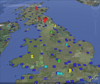
With 649 of the 650 parliamentary seats from the 6th May 2010 General Election now declared, we can see how the policital map of the UK has changed. The one remaining seat is Thirsk and Malton where the death of one of the candidates means that the vote has been postponed until 25th May.
This map has been uploaded to our MapTube website so that the results can be compared with some of our other maps.
Here are some interesting comparisons:
Compare the 2005 election to the 2010 election results:
The 2010 result is shown on the top layer, so move the red slider left and right to see how the political outlook has changed between 2005 and 2010. Apologies for the change in the SNP colour between the two colour scales, but I will upload a new one with standardised colours later. Also, Northern Ireland is missing as we don’t have a boundary dataset for this country, but we are currently trying to obtain one.
Did the MPs’ expenses scandal cause existing MPs to lose their seats?
The top layer shows the parliamentary constituencies where MPs have been told to pay back expenses according to the Sir Thomas Legg report. Slide the top layer slider left and right to see where the parties have changed. This only shows the party colours and not how much MPs were asked to pay back. The result is actually rather inconclusive. Where there are changes, it’s possibly as much a result of boundary changes as expenses repayments. What is required is a comparison that takes both the boundary changes and repayment amounts into account.
Once the final election analysis is available we will add a 2010 turnout map and proportional representation maps of the main parties showing what percentage of the electorate voted for each party by constituency.
There has been quite a lot of interest about using Twitter to crowd source snow amounts, but I couldn’t help wondering how this compares to the data available from the Met Office observing network. Over the period from 20 December 2009 to 15 January 2010 I downloaded the synoptic information from the Department of Atmospheric and Environmental Sciences at the university of Albany. I then processed this using a GTS processor that I wrote, putting the decoded reports for the UK into a postgres database. Then it was a simple matter to write a Java program to interrogate this database and generate a kml file:
Although I could only get data for the hours 06:00, 12:00 and 18:00, the current snow depth will display in the KML animation until the next observation is available. This information is available for every individual hour, only not on the international feed from Albany. The data shown is snow depth on the ground in centimetres from the “sss” group in section 3 of the Synop. The height of the bars represent the depth of the snow, with colours as follows:
While playing around with 3DS Max 2009 for some of our GENeSIS work, I happened to notice that it’s now possible to use .net assemblies in MaxScript. My first thought was to use this for some of our agent based modelling work, but when Fabian Neuhaus asked about importing GPX files, I saw a really easy way of doing this.
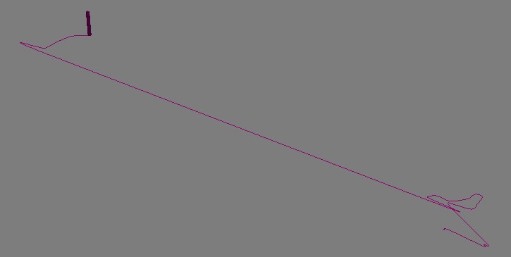
The “System.Xml” assembly in .net makes parsing the GPX file extremely simple. A GPX file is nothing more than an xml file containing a list of trackpoints with a lat/lon and a time. The following script parses a GPX file and generates an animation of a box following a spline which follows the GPS track:
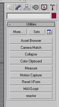
In order to use this, you have to run the script from the MaxScript rollout on the Utilities menu (click the hammer on the right hand side). Then click the “MaxScript” and “Run Script”. Point the file dialog to the file dowloaded from above and it should run.
The script creates a rollout window which allows you to browse for a GPX file to upload. After this is done, the file will be imported, resulting in an “Import Successful” message.
The only problems you might get are to do with the format of time recorded by the GPS in the track. If the import refuses to work, then you might need to change the time format as indicated by the comments in the MaxScript file.
One other thing worth mentioning is that the lat and long coordinates have been multiplied by 1000 in order to cope with a lack of granularity in Max. After producing this version of the script which loads data in the WGS84 coordinate system, I then created another version which reprojects the data into the OSGB36 system that Ordnance Survey uses in the UK. This means that we can match up the GPS tracks in Max with our own data on building footprints which comes from Ordnance Survey.
For movies showing the animated GPX tracks, have a look at the Urban Tick website:
Crowd, transport and urban simulations are at their roots down to ‘Agents’ or ‘Objects’ that are assigned a set of rules as to how to moves in relation to both the environment and other agents around them. 3D Studio Max has a built in ‘Crowd and Delegate’ system which can be used to assign behaviour and therefore create realistic traffic of pedestrian systems in 3D space.
The movie below displays our first tentative steps to explore emergent behaviour via the introduction of simple rules. The movie starts out with a basic ‘wander’ behaviour where the agents only knowledge is the shape of the surface. Moving on we assign each of our ‘cubes’ (of which we have become quite fond of…) a level of vision so they can see ahead and therefore avoid each other and objects in their environment.
Crowd and Delegates – Emergent Behaviour from digitalurban on Vimeo.
Thirdly, the agents seek a ‘sphere’ which could be viewed as a source of food. While being aware of each other and tweaking the way the cubes move a swarm behaviour emerges. Finally, we introduce competing groups with two priorities, firstly to eat and secondly to stay as a group. The majority choose the group over the food but a couple stray off in search of sustenance and lose the other members.
All of these models are going into our exhibition space previewed below to allow a step by step guide to the principles of agent based modelling.
The virtual exhibition space should be online for Windows and Mac in the next few weeks.
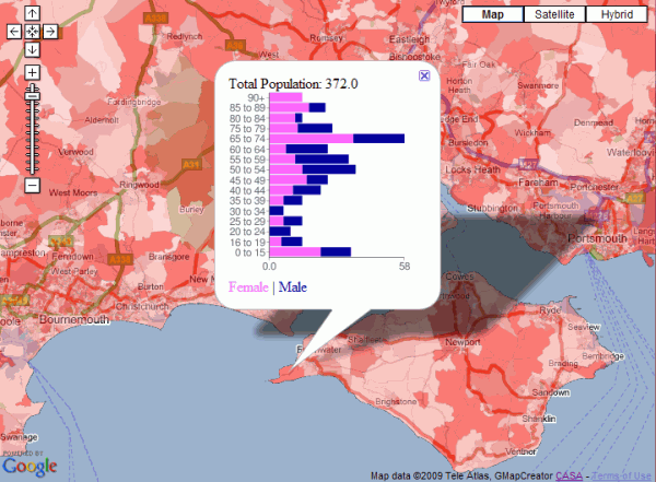
It’s actually a stacked bar chart rather than a traditional population pyramid, but the image below shows male/female population by age for all the output areas in England. The red thematic overlay is total population for every OA, which can be clicked to get the age group breakdown shown in the popup window.
Clickable Age Map
This map is a variation on the original clickable OAC map and was built using a new version of the GMapCreator which contains the clickable technology. Traditionally, maps like this have been built using a server and database to translate the click on the client into a geographic area using point in polygon and then sending the query data back to the client. This method doesn’t scale when you have limited server resources and are looking to handle high numbers of hits, for example with the Mood Maps that we’ve been doing recently. An alternative solution is to build feature coded tiles and let the client handle most of the work displaying the data. Using this system, there is a second set of tiles, one of which the client downloads when the user clicks on a point. This allows the client to work out which feature has been clicked and request the data for that area as an xml file.
The hard part is designing a system which can allow people to design the popup window without having to resort to programming. In the example above, the graph was created using Google Charts via the GMapCreator’s user interface. All that was needed was to choose the data fields from a list and to select the chart type. The URI string to create the chart comes from an xslt transform applied to the xml data. This transform is automatically created by the GMapCreator interface, which also allows the rest of the popup window to be designed using a simple html editor.
The movie below is a visualisation of office and retail space in London. Using data kindly supplied by the Economics Unit at the Greater London Authority, Duncan Smith a PhD student here at CASA has calculated the amount of retail and office in London per 500 metre grid square:
Duncan carried out the analysis in ESRI’s ArcScene as part of his PhD. Intriguingly it is possible to export from ArcScene into Autodesk’s 3D Studio Max allowing a much higher level of visual fidelity. Of course once it is in max you can then export to a number of other platforms, such as Unity as our previous post on digital urban explained using the same data.
Here at CASA we have just completed the initial phase of our London database, as such we will be exploring more ways to visualise city based datasets in forthcoming posts.