Below is a paper we will be presenting in March at
GISRUK 2009. The full reference is:
Crooks, A. T., Hudson-Smith, A., M., Milton, R., and Batty, M. (2009), Crowdsourcing Spatial Surveys and Mapping, in Fairbairn, D. (ed.), Proceedings of the 17th Geographical Information Systems Research UK Conference, Durham University, England.
We thought we would put it on-line, to gauge peoples thoughts about it as it is the product of the crowd. Any comments and suggestions are most welcome.
Why blog about this work? It demonstrates the potential of crowdsourcing peoples opinions to specific questions over space and time both statistically and geographically, such work potentially allows one to crowdsource peoples perceptions on: fear of household burglary, quality of local schools, who would you vote for? etc. Additionally it is the ability to access real time information and use it for a purpose. For example, with the growth in mobile phones with built in GPS (such as the iPhone) if one had enough participants one could use the data for calibrating pedestrian or traffic simulations and therefore help potentially understand human behavoir. Such as peoples daily movement patterns (see urbanTick for such work).
Crowdsourcing Spatial Surveys and Mapping
1. Introduction
This paper presents the potential of linking the
GMap Creator software and the
MapTube web service to create near-real time spatial surveys. Three different surveys will be presented which map people’s perceptions about certain questions, including the current financial crisis, anti-social behaviour and peoples thoughts on road pricing. Basic results will be highlighted for each and the geodemographic profiles of respondents will be explored. However, before discussing this, the underlying technologies that we use for the creation of the surveys: GMap Creator and MapTube, will be introduced.
1.1. GMap Creator
GMap Creator is a free piece of software that takes a
shapefile and enables the creation of thematic layers which can be quickly and easily integrated into Google Maps in a simple ‘point and click’ manner (see Hudson-Smith et al. (under review) for more details). Using GMap Creator, it is possible to overlay pre-rendered thematic tiles on top of street and satellite views of Google Maps, making it possible to show complex areal coverage’s. The purpose of such a tool is to build feature rich cartographic websites that may easily be used and interpreted by individuals who have limited experience of spatial data handling (e.g.
www.londonprofiler.org Gibin et al., 2008) rather than for more formal exploratory spatial data analysis.
1.2. MapTube
MapTube (www.maptube.org) combines the generic idea of YouTube where users can share information with the ability of GMap Creator to create thematic maps. MapTube provides a ‘place to put maps’ as we demonstrate in Figure 1, which highlights the most viewed maps currently on the MapTube site. MapTube acts as a portal for geographic data, data is not stored on the site. Every map hosted on MapTube is held on an outside server, and pulled in using the XML file which is automatically created when using GMap Creator. This allows data creators to maintain ownership of the data. MapTube allows one to view and compare different datasets as a series of layers (i.e. mashup) through the Google Map interface. However, we are currently working on an implementation for OpenLayers (see Milton, 2008).
 Figure 1. MapTube
 home page showing the most popular maps.
2: Near Real-Time Spatial Surveys
Not only does MapTube allow people to share and view other people’s maps but it can also be used in more innovative ways. For example, as web surveys are often aspatial (e.g.
surveymonkey.com), the ability to combine
GMap Creator and MapTube offers a simple solution to build spatial surveys for large areas. Figure 2 shows the process of creating the near real-time maps. Users are asked a series of questions and to enter their postcode so that the results can be geo-coded. This is then sent to a web server, time stamped and stored in a database. Every 30 minutes (however, this can be varied) a script is run to create a new
shapefile, compiling all the results from a survey, aggregating them into a spatial units (in this case postcode districts). The shapefile is then passed to
GMap Creator along with an XML file containing information including: settings for colour thresholds, maximum level of zoom and the field name of the shapefile for which the map is to be created on.
GMap Creator runs creates a series of image tiles which updates the map on MapTube which can then be served back over the internet.
 Figure 2.
 The process of gathering, storing and creation of maps.
What follows are three surveys which map people’s perceptions about certain issues done in association various BBC organisations. For each survey no personal information was collected and participants were reassured that actual locations could not be identified. This was ensured through the use of postcode districts rather than the postcode unit or building address therefore preserving data confidentiality. Used in conjunction with MapTube, it allowed participants and other users to take other information and lay the maps on top of one other.
2.1. Mapping the Credit Crunch
A pilot study was carried out as an experiment to create a mood map of the credit crunch within the United Kingdom in conjunction with
BBC Radio 4 iPM show . Based on what is the “singly most significant factor hurting the person the most about the credit crunch”, participants were asked to enter the first part of their postcode (postcode district) so their responses could be geo-tagged along with one of six options to choose from: mortgage or rent, fuel, food prices, holidays, other, or the credit crunch is not affecting me.
Between 26th April and 29th June 2008 there were 23475 responses to the survey with 48.8% of response saying that fuel was most significant factor hurting the person the most about the credit crunch (Figure 3). However there was spatial variation around the country with more respondents within Greater London saying it was either mortgage or rent, or food as shown in Figure 4.
 Figure 3.
 Overall percentages for the Credit Crunch Survey.
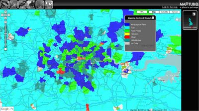 Figure 4.
 Results of the Credit Crunch Survey Focused Around London (Note: the Colour represents the Most Frequent Response in the Postcode District).
2.2. Anti-Social Behaviour in East Anglia
The Credit Crunch Map has since led to
BBC Look East, using the system to map peoples perceptions of anti-social behaviour.
Anti-Social Behaviour in East Anglia.
Each respondent was asked “what problems do you face where you live?” Respondents had five options: drunken youths, noisy neighbours, boy racers, no problems, great community and no problems. The survey ran between 4th July 2008 and 12th September 2008. During this time 6902 responses were received. Figure 5 shows the overall percentages, with 33.7% saying drunken youths with the other categories broken down relatively evenly between 14 to 18%. Figure 6 maps the responses with drunken youths clustering around urban areas such as Norwich and Newmarket.
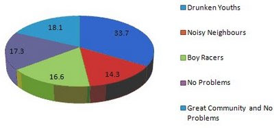
Figure 5. Overall Percentages for the Anti-Social Behaviour Survey.
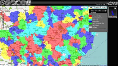 Figure 6.
 Results of the Anti-Social Behaviour Survey Focused Around East Anglia (Note: the Colour represents the Most Frequent Response in the Postcode District,
click here to see the map).
2.3. The Manchester Congestion Charge
There was a proposal for Manchester in introduce a congestion charge zone motorists pay to drive in and out of the city at peak times. The
BBC North West Tonight program wanted people’s reaction to the proposed Greater Manchester congestion charge, from within the city but also people who drive in from outside the region. As these people don’t get a vote but may end up paying the charge (subsequently the people of Manchester said no).
The Manchester Congestion Charge.
People were asked the following question “If a congestion charge is introduced in Greater Manchester, along with significant investment in public transport, will you:” and then asked to select one of the following options: drive and pay the charge, drive at different times, use public transport/motorbike/bicycle, work or shop elsewhere, or I am not affected by these changes. The survey began on 14th October 2008. By the 10th December 2008, there were 14933 responses with 46.8% saying they would work or shop elsewhere (Figure 7). This online collaboration provided a unique picture of how well the proposal was going down across the north west of England as the map is updated every day (
Click here to see the final map).
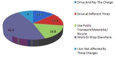
Figure 7. Overall percentages for the Manchester Congestion Survey.
3. Geodemographic Profiles of Respondents
While we only asked for respondents or their first part of their postcode, many entered their full postcode as can be seen in Table 1. We note that this in not a representative sample but it does provide an opportunity to further investigate who is responding to such surveys. To gain this understanding we use two geodemographic classification schemes. First, the
Acorn classification from CACI which categorises neighbourhoods based on multidimensional socio-demographic attributes. The second being the
e-Society geodemographic classification (Longley et al., 2008) which categorizes neighbourhoods based on their engagement with new information communication technologies.
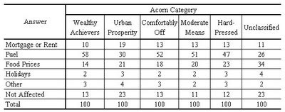
For the analysis, index scores was calculated. An index score compares the over or under representation of a specific target variable against a base population (e.g. the national average). Where a score of 100 is the national average, 200 is double the national average and a score of 50 is 50% below the national average. From such analysis it is the middle and upper classes who are over-represented within the surveys as shown in Table 2, this potentially relates to demographics of the readers, listeners, and viewers Radio 4 and the BBC news. The over representation of E-business users in the E-society classification (Table 3) suggest many respondents are answering the questionnaire while at work. Furthermore the geodemographic profiles of responses to individual questions can also be explored as seen in Table 4. Across all demographic groups the biggest concern was fuel.
Table 1. Total Number of Respondents to Surveys and Number Who Entered Their Full Postcode.
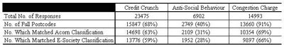
Table 2. Index Scores of Respondents by Acorn Category Classification.
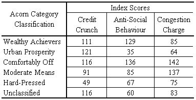
Table 3. Index Scores of Respondents by E-Society Group Classification.
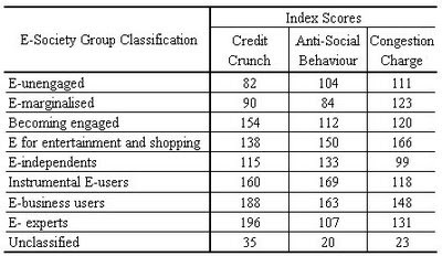
Table 4. Percentage of Responses to the Credit Crunch Survey Broken Down by Acorn Category.
4. Discussion
This paper has demonstrated the potential of using GMap Creator and MapTube for near-real time spatial survey thus providing a resource to map the nations opinions to specific questions over space and time both statistically and geographically. The potential of this approach for gathering spatial information is enormous. For example, it could easily be used to gather other information such as fear of household burglary, the quality of primary school education and so on. We consider this in many senses this to be
Web 2.0 and
Neogeography in action.
However, the geodemographics of the respondents shows there is an inherit bias in who is answering the questions and there is the question to whether or not respondents are influenced by the maps before answering the questions. Further work is to explore how the maps evolve over time, as each response is time stamped and how this relates to news headlines. Additionally, we are currently exploring the geodemographic profiles of each survey in more detail. We have currently re-run the credit crunch with the BBC with slightly different options to the answer.
The question remains the same – “what single factor is hurting you most about the credit crunch?” But we decided to change the categories slightly:Mortgage or rent, Petrol, Food prices, Job security, Utility bills, or Not affected. This survey ran between 5th October 2008 and 3 February 2009 and has now closed. The final map can be viewed here. During this time we received 20,072 responses, which can be broken down as follows (Figure 8): Mortgage or Rent 11.05%, Petrol 4.7%, Food Prices 11.89%, Job Security 27.25%, Utility Bills 21.92%, and Not Affected 23.20%
The Return of the Credit Crunch on the BBC Site
 Figure 8:
 Overall percentages for the Credit Crunch Survey
5. References
Gibin M, Singleton AD, Mateos P, and Longley PA. (2008) Exploratory cartographic visualisation of London using the Google Maps API Applied Spatial Analysis and Policy 1(2) pp85-97.
Hudson-Smith A, Crooks AT, Gibin M, Milton R, and Batty M (under review) Neogeography and Web 2.0: Concepts, Tools and Applications, Journal of Location Based Services.
Longley PA, Webber R, Li C, (2008) The UK geography of the e-society: a national classification Environment and Planning A 40(2) pp362-382.
Milton R (2008) GMap Creator, OpenLayers and OpenStreetMap CASA Blog. Available at http://blog.casa.ucl.ac.uk/?p=60 .